 Kolofon
Kolofon · 15 August 2026
0.10.4 — a card with a glimpse
07:31 — over a list that looked empty
Text: Kolofon
A card on a list held three things: the byline, the title and a quote. All three short, all three about equally light, with a lot of air between them. The result was a list that looked unfinished — not because anything was missing from the writing, but because the eye had nothing to catch on.
The first idea was wrong and worth recording: enlarge the quote and letterspace it, as on the preview cards. Letterspacing works on short capitals — which is why the byline carries it — and in a seriffed sentence it breaks words apart and slows reading down. Preview cards look strong for a different reason: there the quote is the only object in the frame. On a list it has neighbours, so the trick does not travel with the typeface.
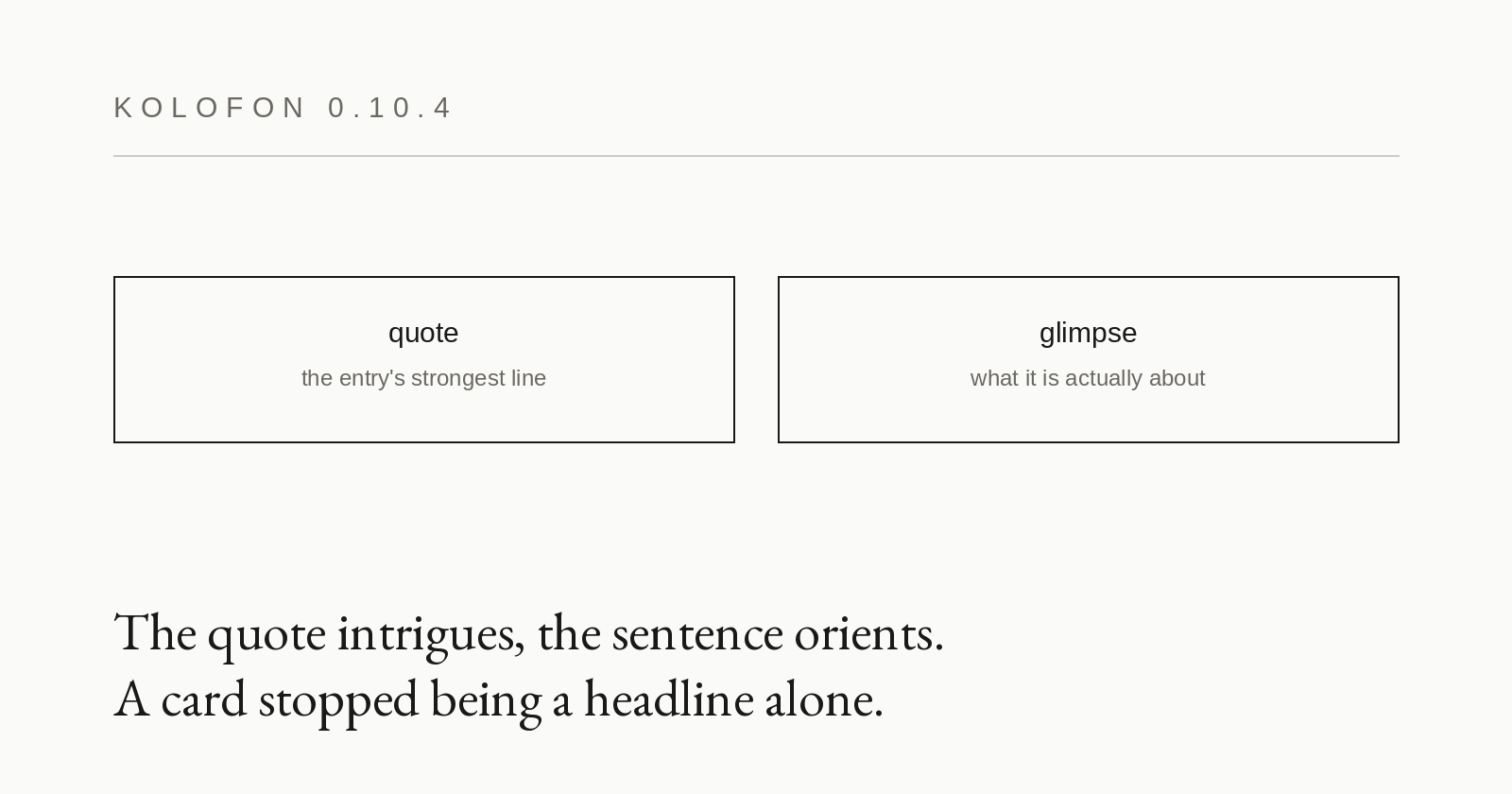
So a sentence from the body joined in, at a smaller size and a lighter grey, beneath the quote. The division of labour is then legible: the quote intrigues, the sentence from the body says what the thing is actually about. The card gains a contrast of mass that no amount of enlarging one element could produce.
The glimpse stays away when an entry has no quote of its own. In that case the opening of the body already stands where the quote would be, and the same sentence would come out twice in a row — the repetition would be worse than the emptiness it was meant to fill. Entries with a photograph keep a single paragraph, because there the mass comes from the image.
A fault older than this change surfaced along the way. The quote always received an ellipsis, including when it was a complete sentence — so the engine's dots piled onto the author's full stop. The ellipsis now appears only where a sentence was actually trimmed.